
ReMind
+ For better documentation in maker education +
Client | IDeATe
Time | Aug 2018 - Dec 2018 (4mos)
My role | User experience research & design (in team of 4)
Skills | Contextual interview, Affinity diagramming, Speed dating, Lo-fi & Hi-fi Prototyping, Wizard of Oz, Usability testing
◇
Highlights
Learning experience design for improving metacognitive skills.
Building web application.
◇
Problem Statement
How might we help maker education students better document their work by improving their metacognitive skills?

Stakeholder - Course instructor
I want to …
Understand student’s progress and thinking
Help students better reflect on the process

User - Student
I want to …
Be reminded to record my working process
Include thinking process in my portfolio
◇
Our Solution

ReMind
An app that optimizes documentation experience. It helps you plan workflow, track progress, reflect on process, and archive assets.
◇
Special Features

◇
Concept Video
◇
Research Process

Initial Problem Space
“How might we help maker education students better document their work?”
The initial problem space was defined by our course instructor Marti Louw, an experienced practitioner of maker education and learning experience design.
Questions To Ask
1. What is documentation in maker education?
2. Why is documentation important?
3. What are the major breakdowns in students’ experiences?

Understanding the Domain
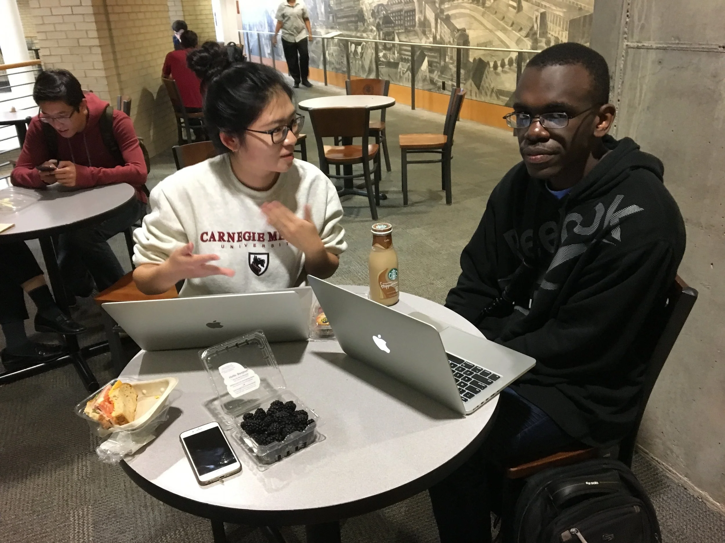
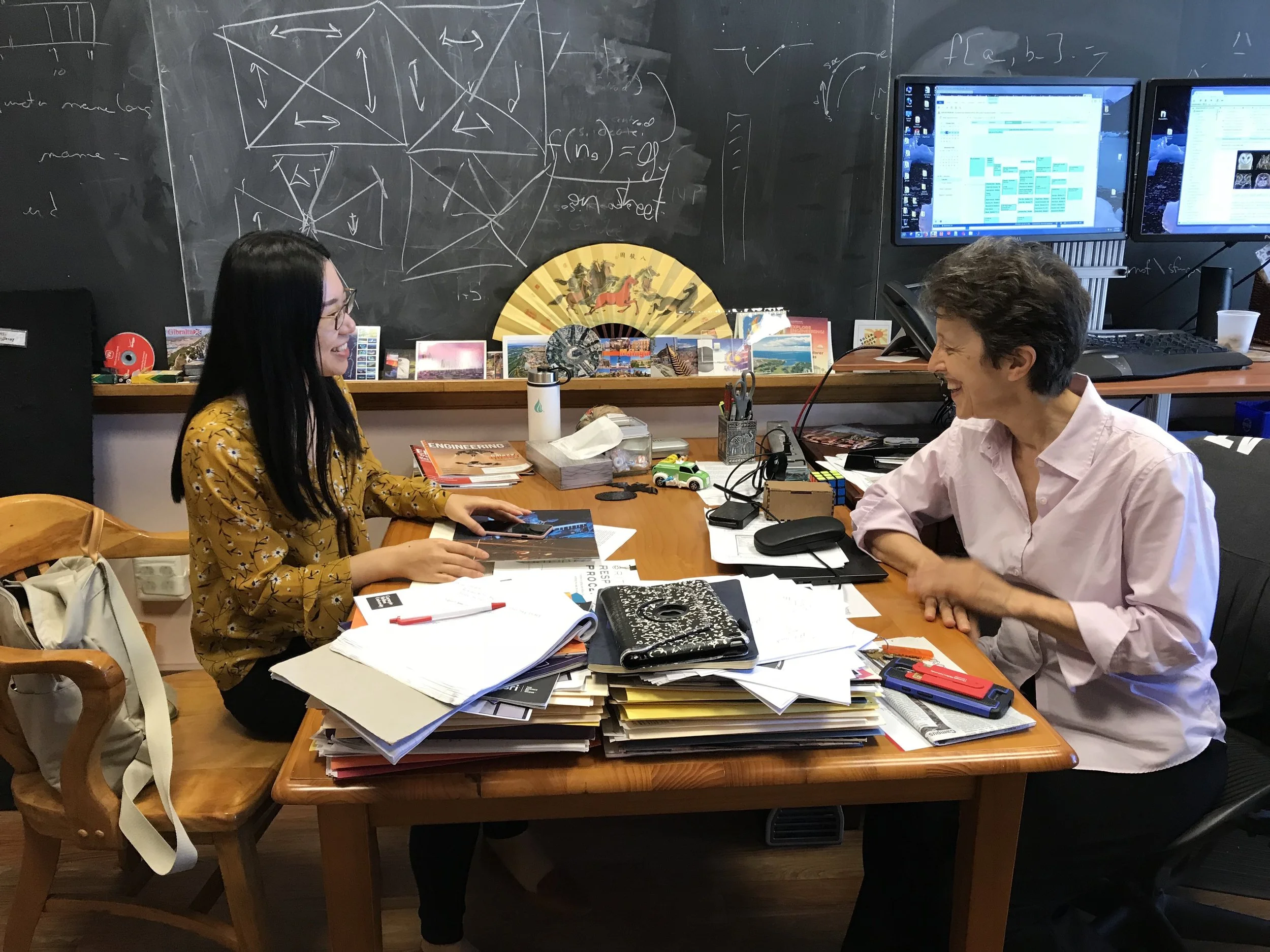
In order to answer the first two research problems, we did two rounds of user interviews :
With previous students who have experience taking maker education courses and “student experts“ who have at least 2 years exposure to documentation and portfolio making.
With maker education course instructors and administrators who had rich experience mentoring student’s documentation process.


First Stage User Study Findings
After the first and second round of user interviews, we were able to draw a general understanding of the problem space we were tackling. In order to communicate the findings, we designed user profiles and a flow model of the idea workflow of documentation process.


User Profile / Persona
User profile is a counterpart of user persona with a greater focus on details and authenticity and less abstraction. In addition to basic information, we also included a sample page from the personal portfolio of the interviewee (with permission) as a reference of the expertise level.

Sequence & Flow Model
The flow model shows the ideal workflow of documentation and portfolio making. This model is important in the sense that it helps define the success of our design innovation.
Answers To The Questions
By analyzing the data we collected, we were able to answer the first two research questions:
What is documentation in maker education?
“Documentation is to show what happened in the tunnel.”
Documentation is less of a presentation of the final outcome, but more of a demonstration of how students think, progress and reflect.
Why is documentation important?
Interestingly, we received difference answers from students and teachers over this question. Students hold a more pragmatic expectation towards documentation since their first priority is to find a job or apply for a school, whereas teachers think documentation is crucial for learning progress and expertise building.
““Documentation is to show what happened in the tunnel.””

Questions Remain
What are the major breakdowns in students’ experiences?
Understanding the Users & Problems
With the last research questions remaining, we began the third round of user study with current students. They are mostly freshmen and sophomores with limited to none experience in documentation in prior. We did two rounds of classroom observations and contextual inquires to understand how documentation fit into student’s workflow and learning project progress.


Affinity Diagramming
In order to make sense of the data we collected, we applied the method of affinity diagramming to consolidate and analyze the research we did so far. By doing so, we found some common breakdowns:
“I always forget to take pictures, especially when the teacher is not around.”
“I just do what the teacher asks, nothing more than that.”
“I don’t know what to include in a reflection.”
...
At this point, we knew students are having trouble keeping track of and reflect on their work. But here is the vital question:
Why?

The Golden Nugget
Driven by the strong curiosity towards the reason behind student’s current issues, we did secondary research and consulted domain experts for the answer. We finally came up with a model to demonstrate different aspects that affect student’s experience and performance.

Diagnostic Model
From this model, we can see the driving reason behind student’s performance is their metacognitive abilities including self-monitoring, self-management, and self-reflection.
“Metacognition is the key.”

The Dilemma
Now that we knew the key, the question would be “How do we help?“ We had a discussion within the team about which side of the “visibility line“ should we innovate in. There are two main directions:

“To facilitate or to educate, that is the question.”

Ideation
At this stage, we decided not to limit the possibilities. Therefore, we continued to the ideation phase with both directions in mind. We wanted to hear from the users and stakeholders which one they like most.

Speed-Dating
With all the storyboards at hand, we did “speed-dating“ with users and stakeholders to collect their opinions, and more importantly to see how they define and prioritize the problem. After several rounds of discussion, we decided to lean towards the “educate“ direction since it brings long-term benefits.

Storyboarding
The storyboard represents all the features we want to include in the product. It also shows how the user will interact with the system.
“Lessons learned: The persona in the storyboard should have a blended identity to show inclusiveness.”

Prototyping & User testing
Having the product perspectives in mind, we began designing prototypes. Before actually drawing the interface, we first conducted a Wizard of Oz testing.


Wizard of Oz
We used a messaging app to simulate the time reminder and reflection prompts. The research goal is to see:
What is the time interval that people feel comfortable being reminded.
What reflection prompts best triggers deeper thinking.
What media format do people use to keep track of their work.
We found out that 30-40 minutes is generally the level of comfortable for most participants. The way they record their work depends largely on the nature of the task. Interestingly, all participants found it very helpful having an external “agent“ because it keeps them more concentrated and efficient than usual!

Paper Prototype
Based on the research findings from the Wizard of Oz, we designer a paper prototype to show the basic information hierarchy and interactions.
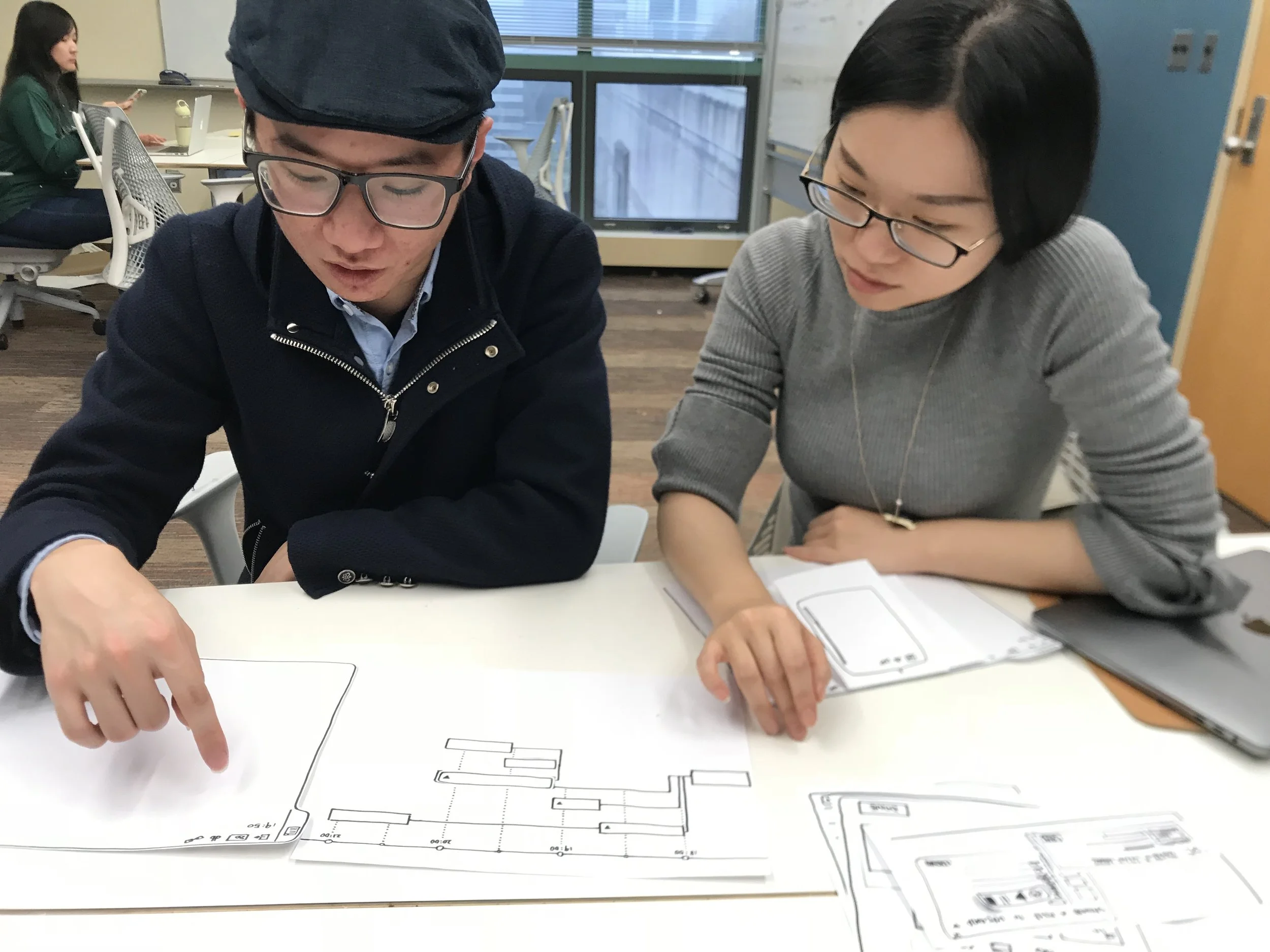

User Testing
For user testing, we assigned some tasks to the participants and asked them to “think aloud“ when navigating through the paper prototype. We were able to see how the design failed their expectation while at the same time collect their opinions of the functions.

Mid-fi Prototype
The next step was to design a clickable mid-fi prototype. We used Figma to collaborate. After finishing, we did another round of user testing and design critique. Some key feedback include:
The progress bar and the timeline of the road map is not very intuitive.
The color scheme is too muted, not aligned with the image of the product.

Final Iteration
With all the insights drawn from previous testing, we iterated the design and came up with a hi-fi prototype. We invited our target users for a final round of user testing and collected their feedback.

High-fi Prototype
1. Redesigned the road map for a clearer hierarchy.
2. Modified the color palette to convey a vibrant, active, and efficient image.
3. Applied WCAG AA standards for accessibility.
4. Used rounded shapes to create a friendly and modern visual style.